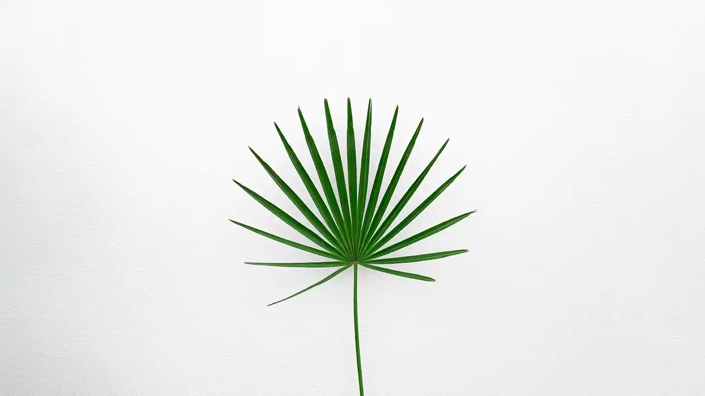
Minimal Leaf Statement is a design approach that emphasizes simplicity, clarity, and the use of natural forms — particularly the clean, elegant shape of a single leaf. This philosophy draws from the minimalist movement, focusing on stripping away excess to reveal only the essential, allowing the beauty of form, color, and texture to stand on its own. Whether in art, branding, or product design, the minimal leaf becomes a quiet yet powerful symbol of balance, sustainability, and refined taste. It’s not just about using a leaf graphic; it’s about conveying a message of harmony between nature and human intention.
A minimal leaf statement works beautifully in various applications, from eco-conscious packaging to modern interior décor. By reducing visual noise and focusing on organic, graceful shapes, the design invites calmness and mindfulness. Instead of loud patterns or flashy colors, the minimal leaf design often relies on neutral tones or soft greens, reinforcing the connection to nature. This visual simplicity makes it adaptable across cultures and trends, giving it timeless appeal.
Importantly, the minimal leaf statement is not limited to visuals alone — it can also influence product choices, materials, and processes. For example, a brand using this approach might favor recycled paper, eco-friendly inks, or sustainably sourced textiles. The statement, therefore, extends beyond aesthetics, reflecting deeper commitments to environmental responsibility. It signals to the audience that the designer or brand is intentional, thoughtful, and aligned with values that prioritize the planet over excess.
Design Language and Emotional Impact
The minimal leaf statement operates as a subtle yet emotionally resonant design language. It communicates calm, renewal, and a deep respect for nature. Viewers often associate these minimal organic shapes with feelings of peace, health, and sustainability — emotions that can strengthen brand loyalty or customer trust. This is why many wellness, skincare, and eco-focused brands lean into minimal leaf visuals: they evoke a promise of gentle, natural care without explicitly stating it.
Additionally, this design approach can influence how a space or product feels. A minimal leaf print on a wall, for example, can make a room feel more open, airy, and alive. In digital spaces, such as websites or app interfaces, a simple leaf icon or motif can break up rigid structures, softening the user experience and making it feel more human-centered. The key is that the leaf is not ornamental clutter but a purposeful, understated accent.
Beyond fresh flowers, tulip-inspired patterns on cushions, curtains, or even wallpapers can bring the same fresh feeling into a room. Designers often use the tulip’s form as a subtle, nature-inspired motif that balances both softness and structure. This allows you to create a calming, nature-connected atmosphere indoors — perfect for spring but welcome at any time of the year.
Plants bring life to our homes and remind us that growth takes patience, care, and a touch of sunlight.
— Robot Fox
Versatility Across Mediums
One of the greatest strengths of the minimal leaf statement is its versatility across mediums. Whether printed on paper, embossed on a product, or integrated into a digital interface, the simplicity of the leaf allows it to adapt fluidly. In fashion, a single stitched leaf on a garment can elevate it from ordinary to thoughtful. In architecture, a laser-cut leaf pattern on a screen or divider adds a touch of softness without compromising modern lines.
Even in storytelling and branding, the minimal leaf can become a recurring symbol — an emblem of growth, transformation, or resilience. Because it is so adaptable, it never feels overused or stale; instead, it shapes itself to fit the context, always carrying that quiet, enduring message of simplicity and natural beauty.
Leave a Reply